I recently received a new paper to try out from Hahnemühle USA, the Harmony 140 lb. cold pressed block. The best way I know of to test new paper is to put it through all the paces -- heavy washes, lifting, masking fluid, and other forms of abuse that I inflict upon my paper in the course of creating a painting. Here's a step by step tutorial of my koi painting, and a review of the paper in the process.
 |
| The Harmony 140 lb CP watercolor block from Hahnemuehle. |
 |
| Here's my drawing of koi with masking fluid protecting parts of the paper. I also outlined the koi with a thin line of masking fluid to allow me to work the background really wet and control the flow of water better. The masking fluid reserves the white of the paper, and the thin outline helps to keep my heavy wet washes from running out of control. |
 |
| I used a variety of dark colors for the backgound, and a lot of palette mud, too. You can see from the puddles and sheen how wet the paper still is at this point. While the paper was still damp, I splashed a few drops of water onto it to create a few tiny spots of blooms. |
 |
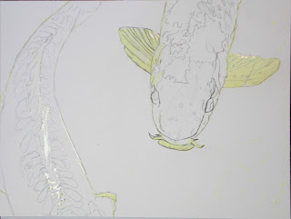
| Next I painted my lightest values on the fish, the yellow colors. Notice my background wash is still wet -- I used a lot of water! |
 |
| Here I added my medium values to the koi, namely the orange and red colors -- cadmiums, vermillion, quinacrodone rose, violet, and a little sepia for the darks. Notice how light the background appears in this photo, compared to the previous photo? That's because it is now dry. I used a lot of water to create the background, and the more water you use, the lighter the watercolor paints will dry. Adding water to watercolor paint is akin to adding white paint to oils or acrylics -- it lightens the colors. |
 |
| More dark values are added using ivory black, sepia, indigo, and violet to create form and roundness to the fish. The masking fluid comes off easily, revealing perfectly preserved paper on which I can now paint. |
 |
| The koi have a freckled appearance to them, which I added with my darkest colors of ivory black. I scrubbed and lifted some areas that I had previously painted, to show some of the lighter patterns in the fish's colors. |
 |
| And finally, this is my finished painting of the koi. |
The Harmony paper from
Hahnemuehle responded beautifully, and held up perfectly despite my abusive painting techniques. It naturally buckled under my heavy washes, but then dried flat. I really gave it a workout and didn't expect it to perform as well as it did, and I was pleasantly surprised that the paper far exceeded all of my expectations. The texture is quite nice, slightly toothy. The paper is surface sized and the amount of sizing appears to be quite generous, giving that the amount of water that I used and the lifting techniques all worked quite well. The color is soft white -- not overly bright, but no hint of any yellow or cream color.
This paper is new, and is currently available at
Art Materials Online. It will be available at other retailers soon.
Labels: art instruction, art lesson, art supplies, art tutorial, artist materials, Hahnemuehle, koi, Painting Demonstration, painting lesson, water, watercolor, watercolor block, watercolor paper


1 Comments:
New Harmony W/C paper from Hahnemühle! Finally an affordable W/C paper that performs like cotton!
Post a Comment
Subscribe to Post Comments [Atom]
<< Home