Sunday, April 29, 2012

Great Brushes From Dynasty Brush!

I just got these wonderful brushes from Dynasty Brush and I LOVE them! The #20 Faux Squirrel is the perfect "must have" brush for all watercolor painters, and the Black Gold series is a fantastic all-purpose brush that performs beautifully with watercolor or acrylics. I had recently worn out my favorite brush after more than 20 years of hard painting with it, and when I mentioned this to Karyn Myers-Berthel over at Dynasty Brush, she asked me all sorts of questions about my brushes and my painting habits. She was like a doctor, diagnosing a patient. She selected these brushes for me, and she really nailed it! These are exactly the right size, shape, and bristle mix for me, and these brushes fit me like a second skin. Words can't desccribe how impressed I am with this! Check out the Dynasty Brush blog and be sure to connect with them on Facebook and Twitter. Best of luck to the artists exhibiting in the Louisiana Watercolor Society 42nd International Show, as one of you is going to win a set of these wonderful brushes as a Merit Award provided by Dynasty Brush!

posted by Annie Strack @ 1:32 PM   0 Comments

Wednesday, April 18, 2012

New Online Class Begins Next Week!

Learn how to capture the beauty and radiance of watercolor—even if you’ve never painted before! Professional watercolorist Annie Strack will take you through the essential techniques and concepts of watercolor painting. You’ll learn how to use your watercolor materials to create washes, work wet-into-wet, suggest value changes, establish color and light, execute stunning compositions and much more.
Course includes downloads of course textbook and video!
COURSE BEGINS: April 24, 2012
COURSE LENGTH: 4 weeks
COURSE MATERIALS (included with tuition):
TUITION: $149.99 ($135.00 for VIP)
INSTRUCTOR: Annie Strack (Bio)
REGISTERWHAT YOU’LL LEARN:
  • Using essential watercolor materials with confidence
  • Executing basic watercolor techniques including a variety of washes, working wet-on-wet and wet-on-dry, and positive and negative painting
  • Suggesting depth and light with color and value
  • Completing a watercolor painting from beginning sketch to finished piece
WHO SHOULD TAKE THIS COURSE:
  • Students who have completed Drawing for the Absolute Beginner, Level 1 or Drawing for Beginners, Level 2
  • Aspiring artists new to watercolor painting
  • Experienced artists who want to learn proven techniques
  • Watercolorists who want to freshen up their skills
SUGGESTED ART MATERIALS:
Pigments
Alizarin Crimson
Burnt Sienna or Sepia
Cadmium Orange
Cadmium Red
Cadmium Yellow
Cerulean Blue
Prussian Blue
Yellow Ochre
Surface140–lb (300gsm) cold-press watercolor
140-lb (300 gsm) hot-press watercolor paper
Brushes
3-inch (76mm) hake
No. 2 round
No. 6 round
No. 10 round
Tools
2B pencil
Facial tissue
Kneaded eraser
Masking tape
Mounting board (Masonite, plywood or watercolor board)
Palette or plastic plates
Table salt
Water container(s)
REGISTERCOURSE SYLLABUS
Lesson 1:
Essential Watercolor Techniques
  • Basic watercolor materials
  • Mixing paint and handling brushes
  • Working wet-on-wet, wet-on-dry and drywashes
Homework:
Complete the following exercises to practice key watercolor techniques. You may use the pigments recommended in your textbook or you may select your own pigments:
  • Applying a Flat Wash, page 49.
  • Applying a Gradated Wash, page 50
  • Applying a Variegated Wash, page 51
  • Adding Salt, page 57
  • Lifting Paint, page 58
Session 2: Drawing, Value and Color Basics
  • Structural drawing techniques
  • Understanding value and color
  • Using color intensity to suggest atmospheric perspective
  • Composition basics
Homework:
Complete the following exercises to improve your understanding of how color and value work.
  • Making a Value Scale, page 27
  • Once you’ve made a value scale, practice creating value changes and suggesting shadow and light by painting the shapes on the bottom of page 26.
  • Create your own color while, following the exercise, Making a Color Wheel, on page 33.
  • Practice suggesting atmospheric perspective by re-creating the three groupings of trees you see on page 29.
Session 3: Positive and Negative Painting
  • Suggesting texture
  • Understanding positive and negative space
  • Color temperature
Homework:
Practice working with positive and negative shapes by completing the following demonstrations:
  • Positive Painting, pages 80–83
  • Negative Painting, pages 84–89
Session 4: Basic Painting Approach
  • Composition planning
  • Mixing and layering paint
  • Light effects
Homework:
Complete the Structural Drawing demonstration, pages 68–71, then use that sketch as a basis for completing the Painting with Three Colors demonstration on pages 76–79.
REGISTER

posted by Annie Strack @ 4:11 PM   0 Comments

Friday, April 6, 2012

Step-by-Step Painting Progress

This is my most recent painting, just finished this week. I'm using a photo that I shot during one of my recent trips to St. John, USVI, as a reference for this painting. This harbor scene was photographed late in the day, just as the sun was beginning to set. The light from the sunset is reflected off the white hull of the old ship, and the reflections bounce off the suface of the water in the forground. 
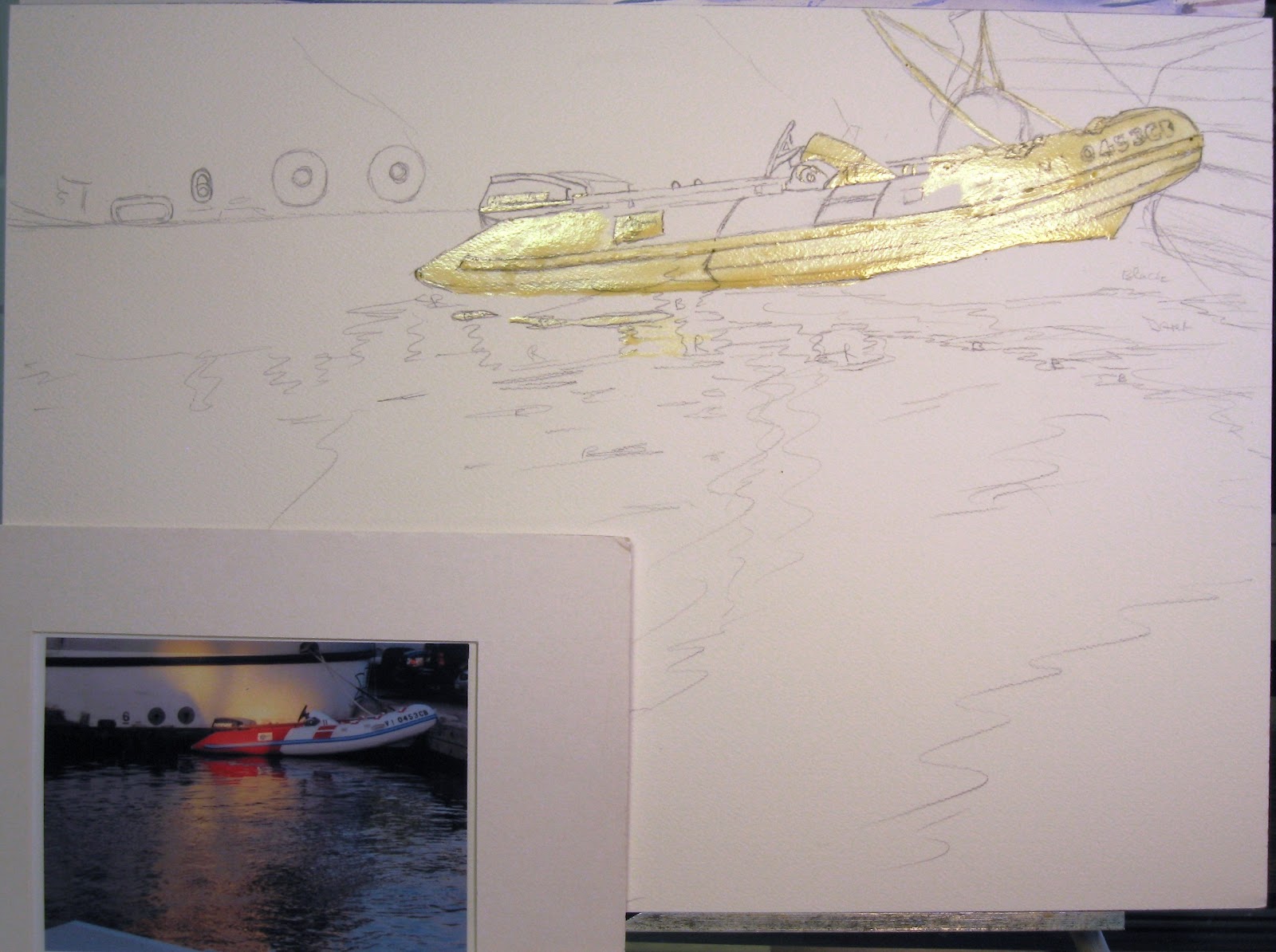
 Here you can see my reference photo next to my drawing. I covered the drawing of the boat with masking fluid, to preserve the white of the paper for painting later.
 Working from light to dark, I start by painting the reflected colors of the sunset on the ship's hull and the water surface, using yellow ochre, cadium yellow,  and cadium orange. I used cobalt mixed with violet to create the shadowed color of the ship's white hull.
 For the water, I started with cobalt for the lightest values and used indigo and payne's grey for the darker areas. I don't want the water to appear flat and lifeless, so I'm varying my colors and values in large areas.
 I'm using large soft brushes at this point in the painting , to maintain a loose painterly effect. A large squirrel mop is used to paint wet-in-wet, and when that dries, I switch to a 3/4" flat squirrel to paint movement in the water. For details, I used a large round Kolinsky sable. These brushes are all very soft, and lend to a looser effect.
 After each layer of paint is dry, I can adjust the colors and values by adding more layers to make areas darker or deeper, and I can lighten areas by lifting pigment off the painting.
 Here you can see the angle of the flat brush used to create movement in the water. A large soft flat brush holds and releases a lot of fluid, which allows me to keep my brush stokes loose and fresh. Drawing the brush-edge at an angle in varying strokes across the painting creates these ripples in the water.
 These soft Kolinsky and squirrel brushes that I'm using on this painting are from Raphael by Sennelier, and are some of the finest natural bristle brushes available. Top quality materials and supplies are essential to creating great art.
 Layering the darkest values and colors last, a realistic impression of movement is created in the water.
 When the backgound is mostly finished, I remove the masking fluid from the boat, and I reapply it just to a few areas that still need to be protected. Now I can start painting the darker details, and begin to show dimension and roundness to the boat by painting in some shadows.
 When the shadows are dry, I begin to layer color on the boat. The red of the inflatable is painted using carmine and cadium orange. As I paint colors on the boat, I also paint the matching reflections on the water while I have the correct color still on my brush.
 At this point, I've switched to a synthetic round brush which is stiffer than the natural brushes I was using earlier. The stiffer brush allows me to maintain much more control and paint the details with more precision.
 The last of the masking fliud is removed, leaving white areas where I can now paint the final details of the trim. The water felt too cold for me, so I glazed some yellow ochre on top of the blue on the right side of the painting, which created a warm green tone and added to the translucency of the water.
 Cobalt blue is painted for the bumper trim, and hand-holds and labels are painted to make the final details.
A few darker areas are made darker, and some tiny details are refined. To add to the effect of the sunlit glare on the inflatable, I used a damp brush and lifted some of the pigment off the red part of the boat and off of the blue bumper trim, which lightened it just a little and gives it the effect of glare from bright sunlight washing out the colors. I think it's done, but I'll put it away for a a couple of weeks before I decide!

posted by Annie Strack @ 10:28 AM   3 Comments

All images and content copyright Annie Strack 2023. Although I occasionally receive compensation for some posts, I always give my honest opinions, findings, beliefs, or experiences on those topics or products. The views and opinions expressed on this blog are purely my own.